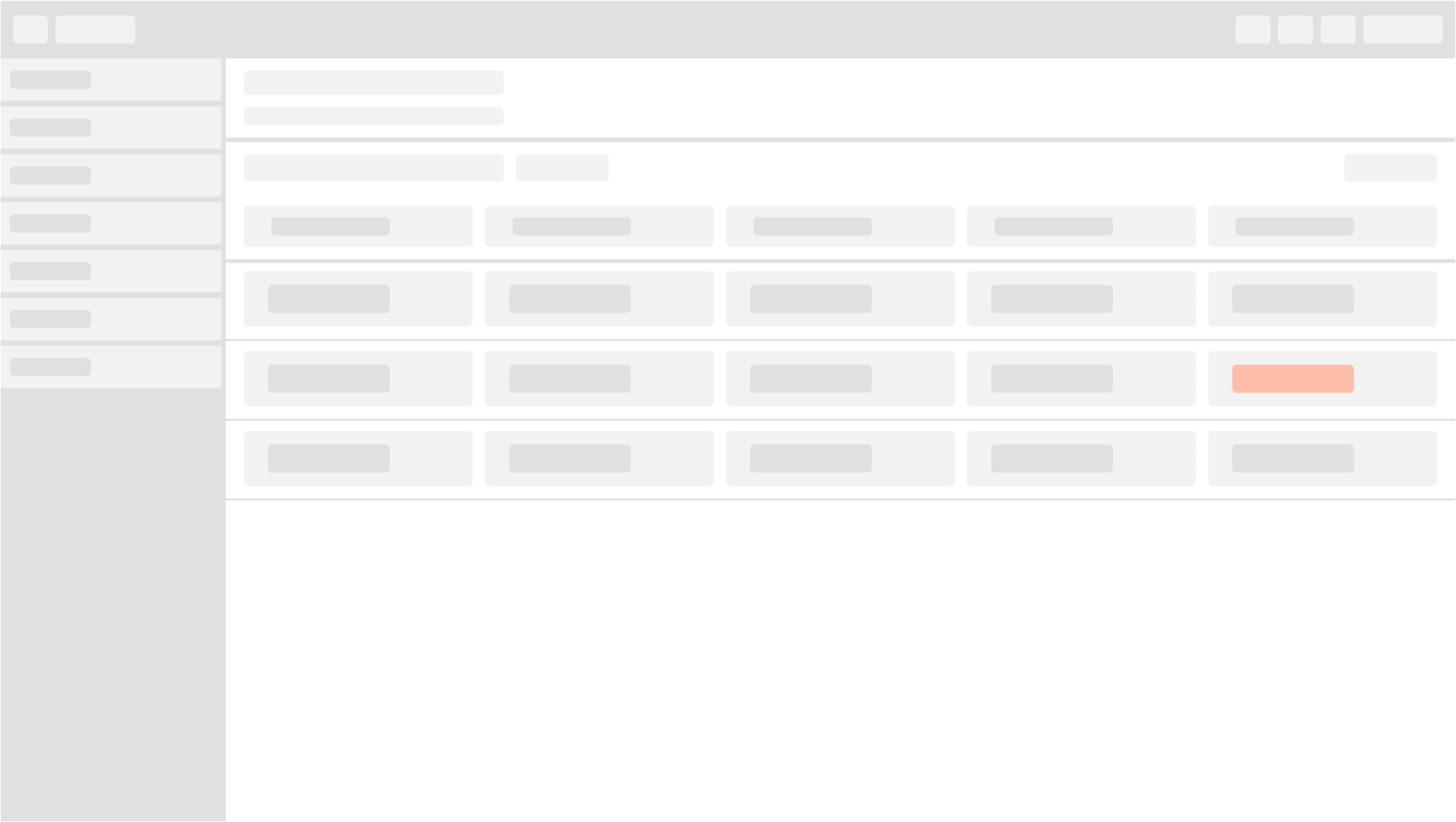
Web Standards

Company
Technergetics
Timeline
2022-24
Role
Lead UX Designer
Contributions
Secondary Research
Strategy
Documentation
Handoff
Background
Technergetics delivers software in an extremely fast-paced agile enviornment. Keeping technical debt at a minimum is the upmost priority, unfortunately delivering good experiences can tend to get overlooked.
Goal
Technergetics needed a way to put forth operations that would contribute to rapid development processes while ensuring satisfaction of experiences for users.
Establishing design standards for web apps aimed to unify all products within their logistics portfolio. Leveraging open-source libraries provided a foundation to scale but at a cost of internal language and documentation to rely on.
To curate design documentation that reflects best practices and adheres to business use cases. Design documentation streamlines internal processes by giving development training wheels to make design decisions on the fly, reuse and unify patterns for all products, and ensure familiarity is the upmost priority for users.
Outcome
Partnering closely with a UX engineer, we allocated time weekly to get after Technergetics design standardization. Analyzing re-occuring themes and patterns that have already been implemented in current and previous products enabled us with a priority starting point. Gathering secondary research on best practices for patterns, specs, and other interaction-esque functionality gave us initial tools we needed to make sure we were tackling this with our best foot forward.
A majority of web standards compiled are in relation to table experiences. Shown below is what has been compiled prior to my departure, but as they say, design never ends.
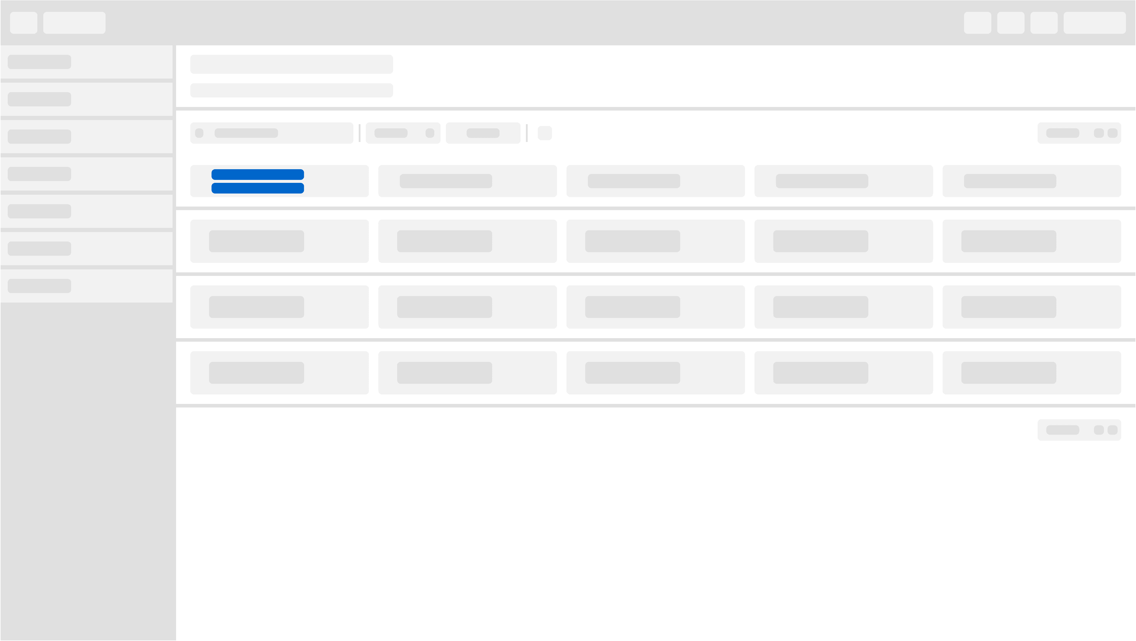
Row selection
Breadcrumbs
Breadcrumbs are a secondary form of navigation that assists users in getting to content nearby in the hierarchical structure. They are especially useful when users arrive to the site through an external link and don't start with the homepage.
One of our row selection patterns consists of navigating the user to a new page. This new page will then be nested within the parent page resulting in a breadcrumb. The breadcrumb will be located in the header component, above the title and description.
Split View
A split view manages the presentation of multiple adjacent panes of content, each of which can contain a variety of components, including tables, collections, images, and custom views.
One of our row selection patterns consists of populating the adjacent pane to display supplementary information. The adjacent pane will remain present with an empty-state, thus content populated on-row select.
Perform action
A toolbar is used to control all functionality for the entire table.
One of our row selection patterns consists of selecting a row via a checkbox to perform row related actions “row-specific” within the toolbar. If only one row is able to be selected at a time, remainder of row checkbox’s should be disabled. Actions that control the entire table “table-specific” will be separated from “row-specific” controls.
Table scroll
Inner body scroll
Inner body scroll refers to a specific layout technique used when designing tables within a user interface. In this approach, the body of the table is contained within a fixed-height scrollable container, allowing users to scroll through large datasets while keeping the table header and any other fixed elements visible. Inner table body scrolling is a popular UI design pattern for displaying tabular data in web applications, dashboards, and data visualization tools. By combining a fixed header with a scrollable body, this approach provides users with an intuitive and efficient way to navigate through large datasets while maintaining context and usability.
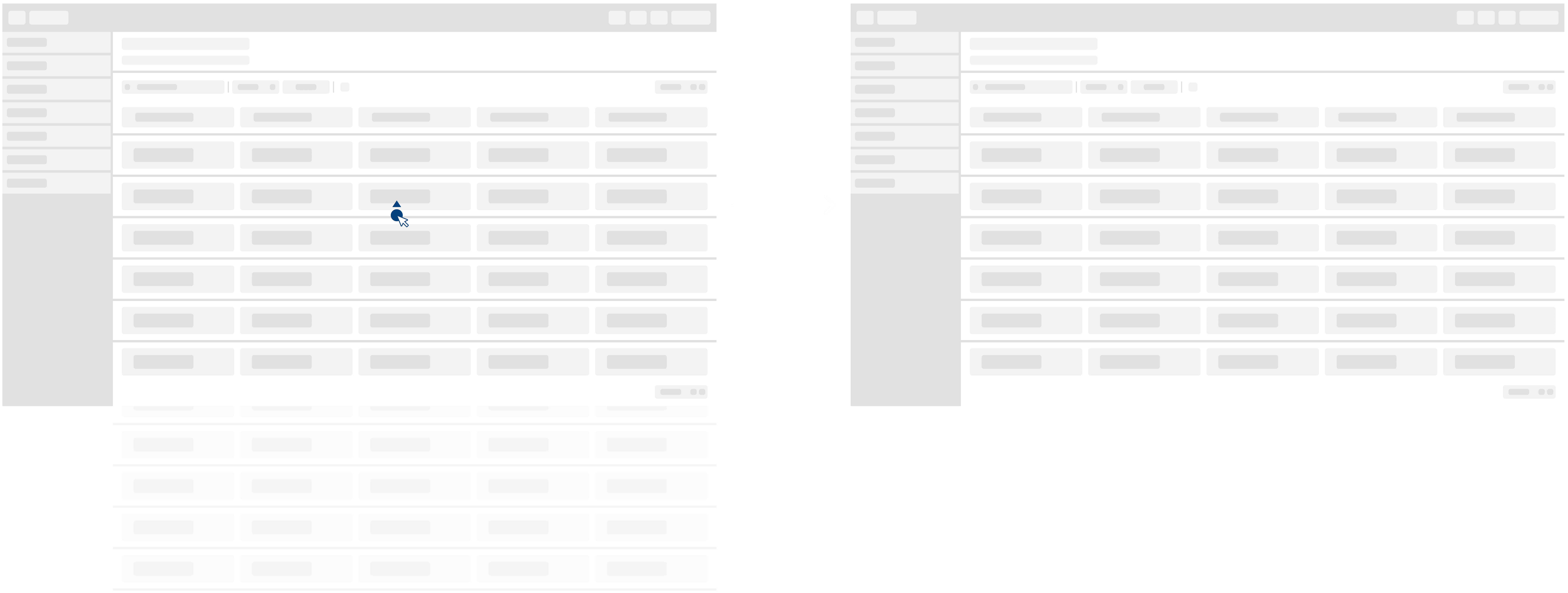
One of our table patterns consists of the table body scrolling while other table related elements stay in a fixed position. Since our table rows max out at 25, the user then can scroll until they reach the max then paginate.
Toolbar elements
Search
Toolbar search refers to a specific user interface element commonly found in applications that display tabular data. It typically consists of a text input field accompanied by a search icon or button, placed within the toolbar or header section of a table or data grid. Overall, the search bar in a table toolbar enhances the usability and efficiency of data exploration and analysis tasks by providing users with a convenient and intuitive way to search and filter tabular data according to their preferences and requirements.
One of our toolbar attributes consists of a search bar. The search bar will always be left aligned within the toolbar and max width is 275px.
Actions
Toolbar actions are specific interactive elements or controls found within the toolbar of a table interface. These actions enable users to perform various operations related to manipulating or interacting with the table's data. These toolbar actions enhance the usability and functionality of the table interface by giving users convenient ways to interact with and manipulate the displayed data. They help users perform tasks efficiently and customize their interaction with the table according to their needs.
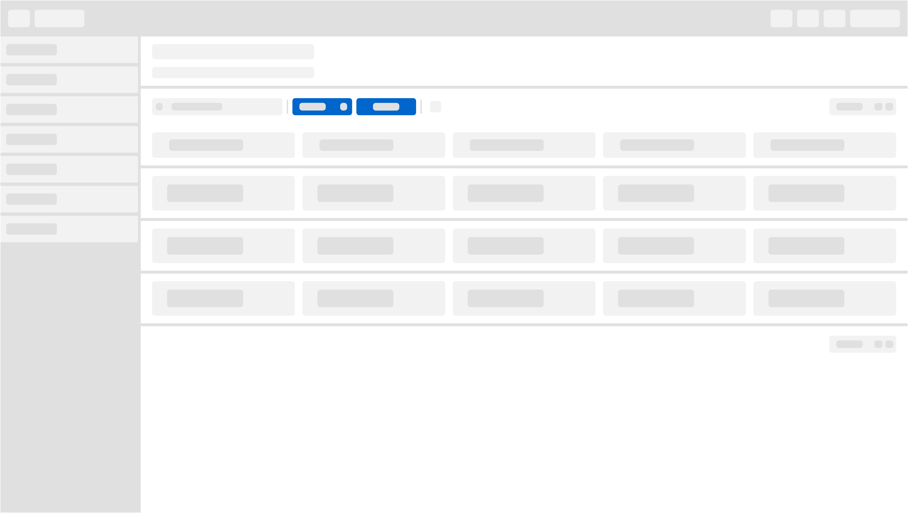
One of our toolbar attributes consists of actions. The location of actions should follow the search bar. Actions within the toolbar consist of a primary action button dropdown, and secondary buttons. Primary action button dropdown will be utilized for row specific functionality. Secondary actions will be utilized for performing table-specific tasks.
Pagination
Toolbar pagination refers to the implementation of pagination controls within a toolbar or header section of a user interface. This design pattern allows users to navigate through multiple pages of content, typically within a table, list, or grid, by providing intuitive controls directly accessible from the toolbar. Toolbar pagination UX design enhances the usability and efficiency of navigating through large datasets or content sets by providing users with intuitive and convenient controls directly accessible from the toolbar. It allows users to explore and interact with content seamlessly while maintaining a clear and organized user interface.
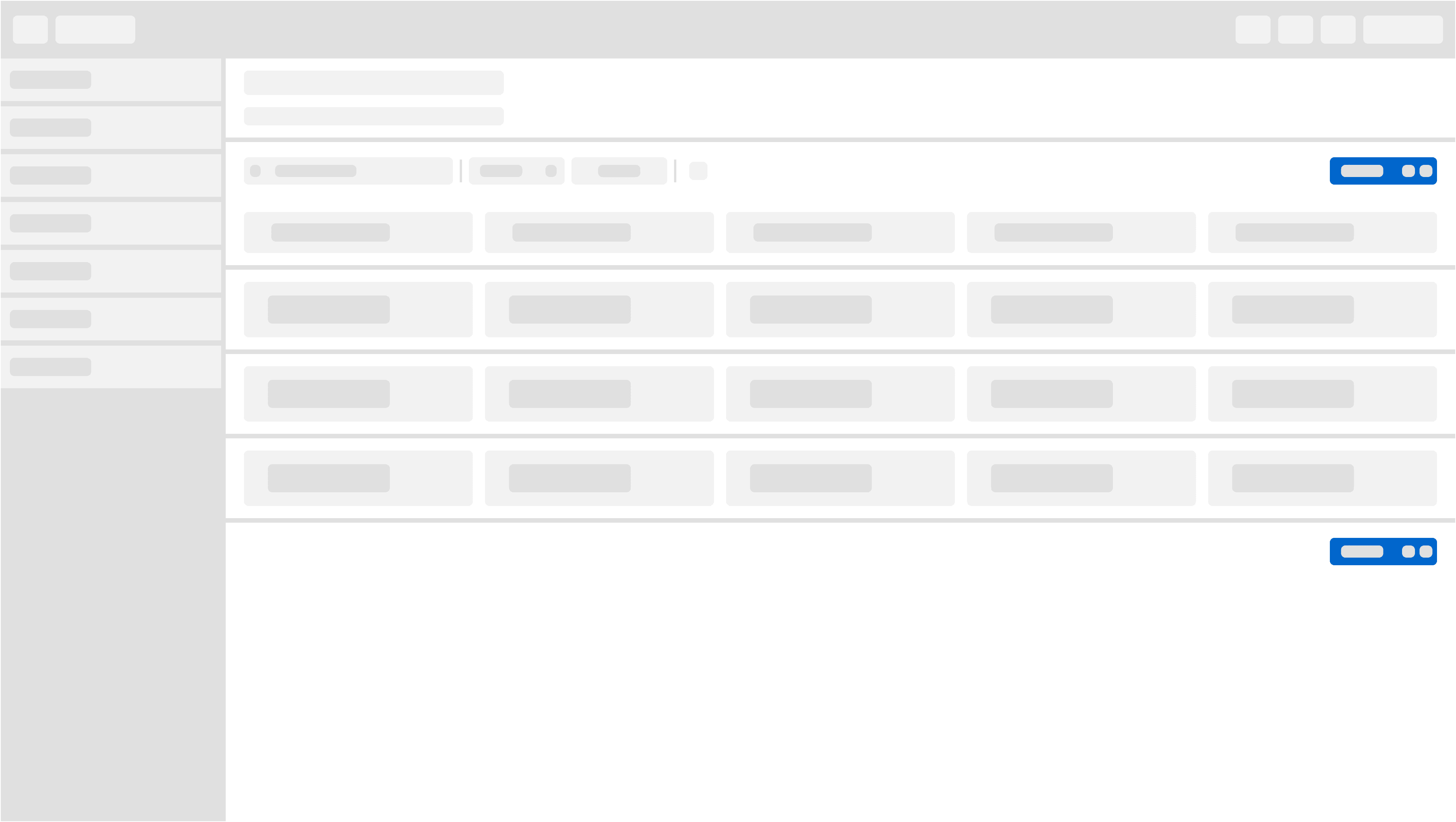
One of our toolbar attributes consists of pagination. Pagination should always be right-aligned within the toolbar. Pagination should start at 25 rows max (1 of 25) as the default state. If the data set is more or equals to 1000, show 1 - 25 of 999+. Pagination will allow our users to navigate through mass amounts of data in an organized way. Pagination will also be present at the bottom of the table, to provide quick access wherever their cursor is.
Settings (future implementation)
Toolbar settings refer to the options and configurations available for customizing the toolbar in a user interface (UI). A toolbar is a row or column of buttons, icons, or menus that provides quick access to frequently used features, tools, or actions within an application or website. Toolbar settings allow users to tailor the toolbar’s appearance and functionality to suit their preferences or workflow.
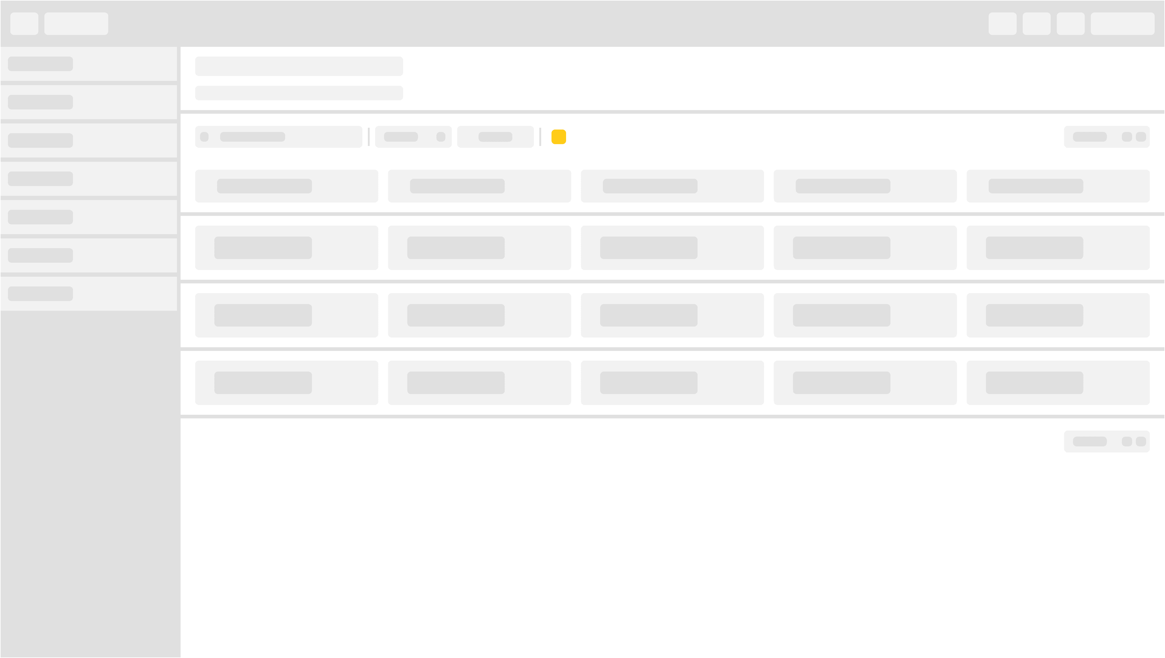
One of our toolbar attributes that aims to be included in future development is settings. To setup the toolbar for scale, it is important to implement a parent entity with opportunity for children. As table functionality becomes more robust, configurability will be crucial to the experience.
Table typography
Sentence case
Sentence case refers to a typographic style where the first letter of each sentence is capitalized, while the rest of the letters are lowercase. This capitalization style is commonly used for headings, titles, and labels in user interfaces to ensure consistency and readability. Sentence case is considered more readable than all uppercase (uppercase) or all lowercase (lowercase) text, as it maintains the natural flow of sentences while still providing visual emphasis on the beginning of each sentence. It is also less formal than title case (where major words are capitalized), making it suitable for informal or casual interfaces.
One of our table specs consists of making sure our typography usage is consistent throughout. We are utilizing sentence casing for our table headers [Aa].
Text wrapping
Text wrapping refers to the automatic adjustment of long lines of text within a defined space, such as a text box, container, or layout grid. When a line of text reaches the edge of its container, text wrapping causes the text to continue onto the next line instead of extending beyond the boundary. Overall, text wrapping is a fundamental aspect of UI design that contributes to the readability, accessibility, and aesthetics of digital interfaces by ensuring that text adapts seamlessly to its surrounding layout and constraints.
One of our table specs consists of wrapping text. When we anticipate long table headers we are utilizing the text wrapping pattern so the user has a visible grasp on what the header is. Truncation is not allowed for headers.
Truncation
Truncation refers to the process of shortening or cutting off long blocks of text that exceed the available space within a user interface element, such as a text box, label, or table cell. Truncation is often necessary when there isn't enough room to display the entire text, and it helps prevent text from overflowing or extending beyond the boundaries of its container. Overall, truncation is a useful technique in UI design for managing long blocks of text and ensuring that content remains readable and visually consistent within the constraints of the interface layout. When used appropriately and combined with clear visual cues, truncation can enhance the usability and effectiveness of user interfaces across various digital platforms and devices.
One of our table specs consists of truncating cell text and providing a tooltip on hover. We allow cell truncation over header truncation due to being able to associate tabular data with its respective header at a glance. If the header was truncating, the interaction cost would be great.
Workflow status
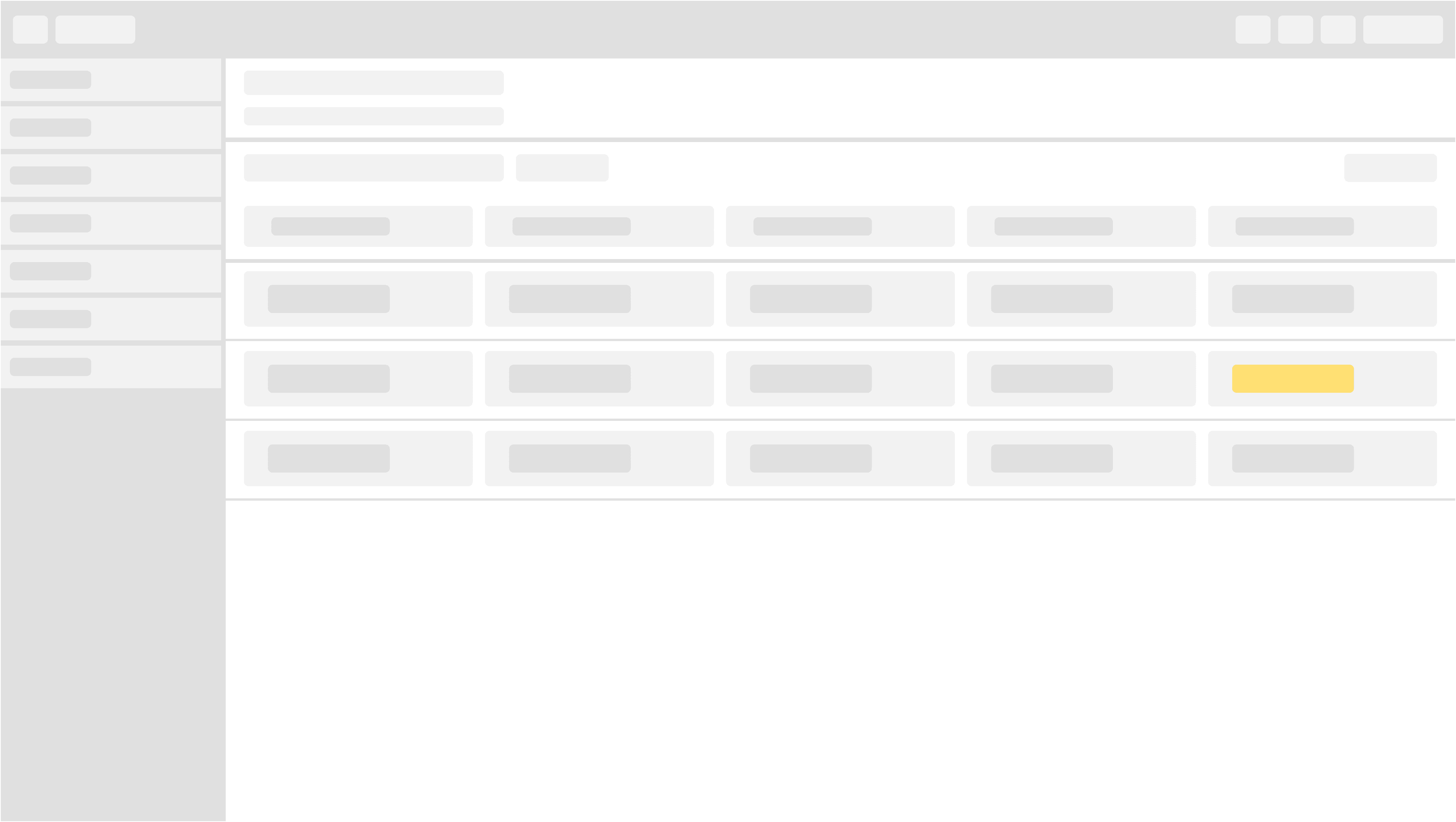
Pending
A label is a static piece of text that people can read and often copy, but not edit. Labels display text throughout the interface, in buttons, menu items, and views, helping people understand the current context and what they can do next.
One of our table row attributes consists of a label. Text as well as color accompanying each other to provide workflow context is cruical to our experiences. We denote the lable yellow to train the mental model, so as the user gets comfortable with our experiences they will be able to associate yellow with an pending context in relation to their workflow.
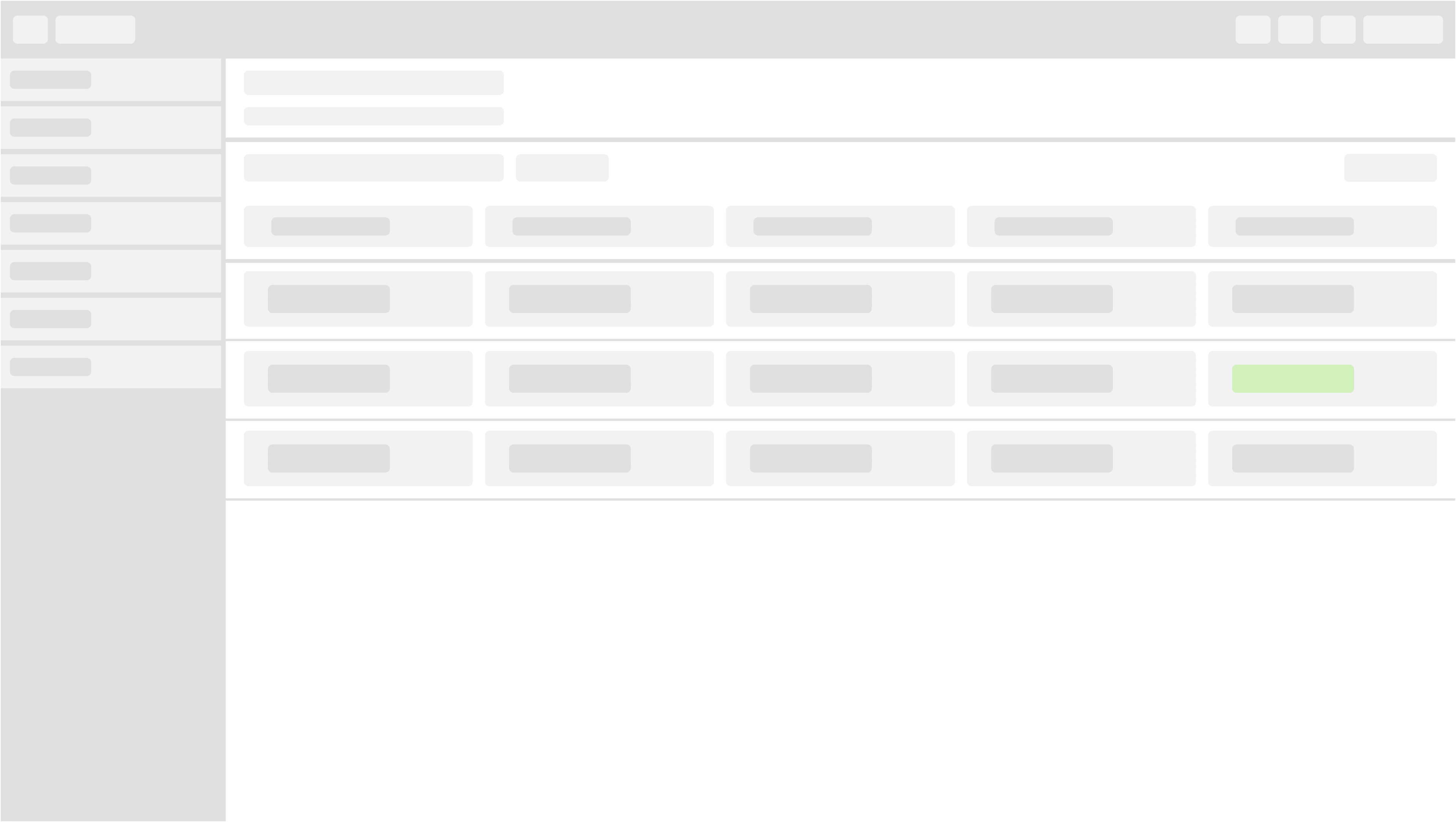
Complete
One of our table row attributes consists of a label. Text as well as color accompanying each other to provide workflow context is cruical to our experiences. We denote the lable green to train the mental model, so as the user gets comfortable with our experiences they will be able to associate green with an complete context in relation to their workflow.
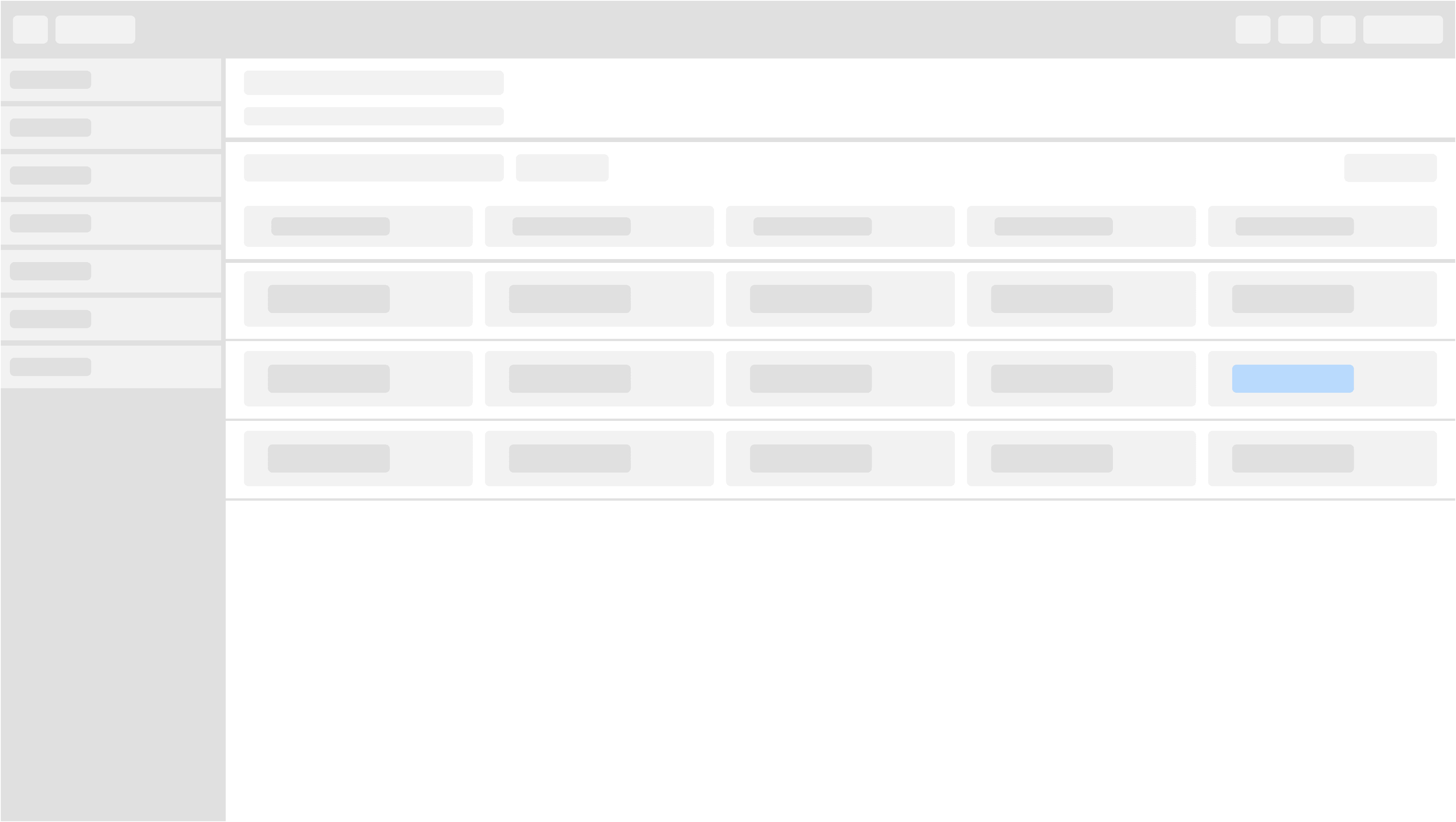
In-progress
One of our table row attributes consists of a label. Text as well as color accompanying each other to provide workflow context is cruical to our experiences. We denote the lable blue to train the mental model, so as the user gets comfortable with our experiences they will be able to associate blue with an in-progress context in relation to their workflow.
Disruption
One of our table row attributes consists of a label. Text as well as color accompanying each other to provide workflow context is cruical to our experiences. We denote the lable red to train the mental model, so as the user gets comfortable with our experiences they will be able to associate red with an disruption context in relation to their workflow.


