Mobile Standards

Company
Technergetics
Timeline
2022-24
Role
Lead UX Designer
Contributions
Secondary Research
Strategy
Documentation
Handoff
Background
Technergetics delivers software in an extremely fast-paced agile enviornment. Keeping technical debt at a minimum is the upmost priority, unfortunately delivering good experiences can tend to get overlooked.
Goal
Technergetics needed a way to put forth operations that would contribute to rapid development processes while ensuring satisfaction of experiences for users.
Establishing design standards for mobile apps aimed to unify all products within their logistics portfolio. Leveraging open-source libraries provided a foundation to scale but at a cost of internal language and documentation to rely on.
To curate design documentation that reflects best practices and adheres to business use cases. Design documentation streamlines internal processes by giving development training wheels to make design decisions on the fly, reuse and unify patterns for all products, and ensure familiarity is the upmost priority for users.
Outcome
Partnering closely with a UX engineer, we allocated time weekly to get after Technergetics design standardization. Analyzing re-occuring themes and patterns that have already been implemented in current and previous products enabled us with a priority starting point. Gathering secondary research on best practices for patterns, specs, and other interaction-esque functionality gave us initial tools we needed to make sure we were tackling this with our best foot forward.
Mobile standards compiled are in regards to a baseline for how our experiences should look and feel. Shown below is what has been compiled prior to my departure, but as they say, design never ends.
Controls
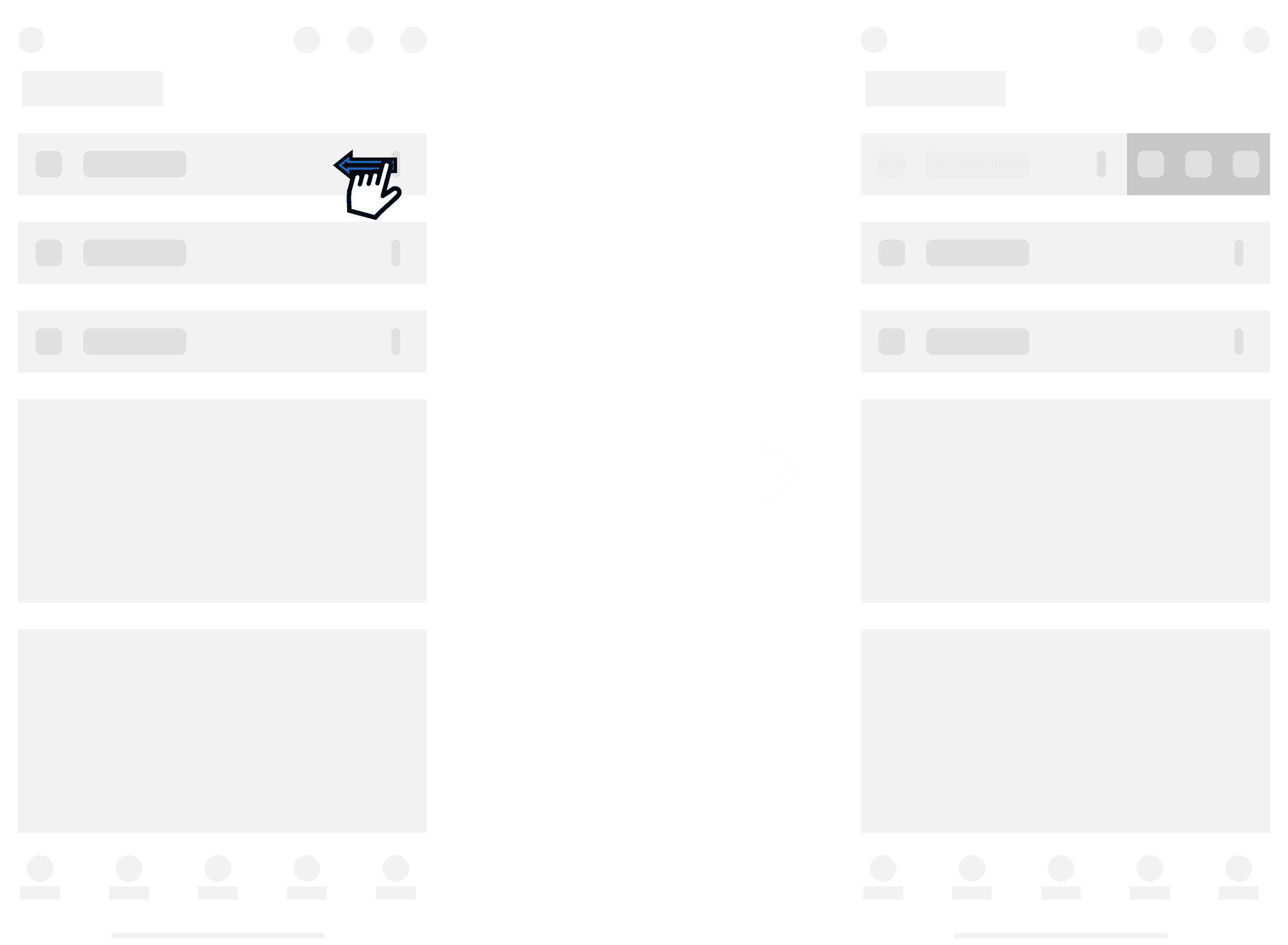
Contextual swipe
Contextual swipe refers to the action of using swipe gestures to reveal or access additional controls or options within a mobile app or interface. In this design pattern, users can swipe in a particular direction (usually from the edge of the screen) to reveal hidden controls or menus, which may include navigation options, settings, or additional actions related to the current context.
One of our control patterns consists of hiding additional functionality related to the primary context. These may be present within list items as you swipe left actions will be come present.
Modalities
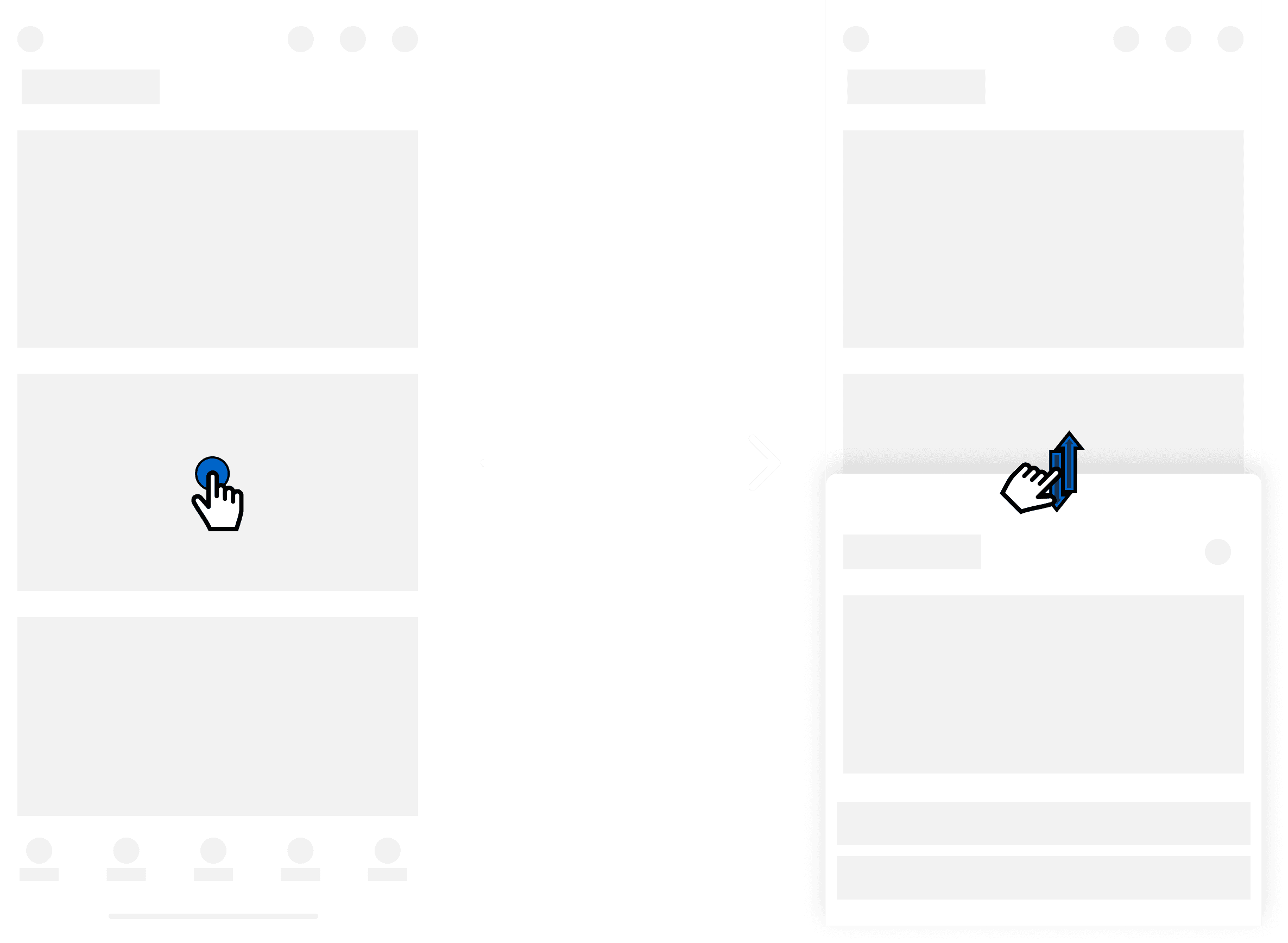
Supplementary information
A bottom sheet refers to a UI component that slides up from the bottom of the screen to display additional content or options without fully covering the main interface. It's a popular design pattern for presenting contextual information, actions, or settings in a non-intrusive manner.
One of our modality patterns consists of initiating a bottom sheet when presenting supplementary information to our user. This aims to not break the user’s workflow but act as an additive to support the workflow.
Additional information
One of our modality patterns consists of initiating a bottom sheet when presenting additional information to our user. Similar to supplementary, this modality aims to convey information at the lowest level, not being as substantial as supplementary. No scrim involved aims to not center attention on modality and allow flexibility for main screen interaction due to low priority compared to main context.
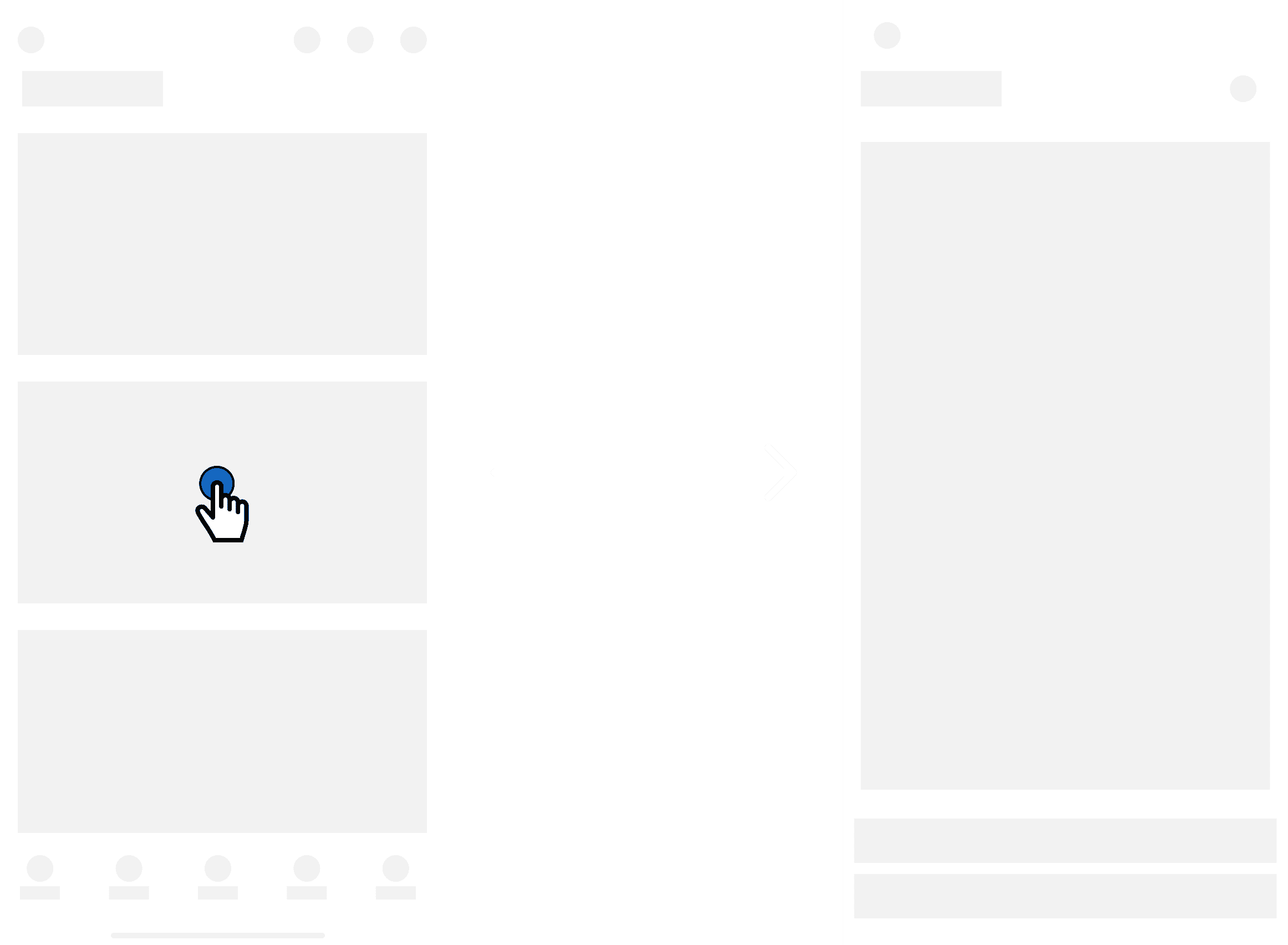
Standalone information
A full-sheet modal refers to a design pattern where the entire screen is occupied by a single element, such as a modal dialog, a settings panel, or a content view. This design approach maximizes the use of screen real estate, providing a focused and immersive experience for the user.
One of our modality patterns consists of initiating a full sheet when directing the user to a task that is outside of their primary workflow. This modality acts as a standalone way to complete a task, thus redirecting them to their primary flow when task is completed.
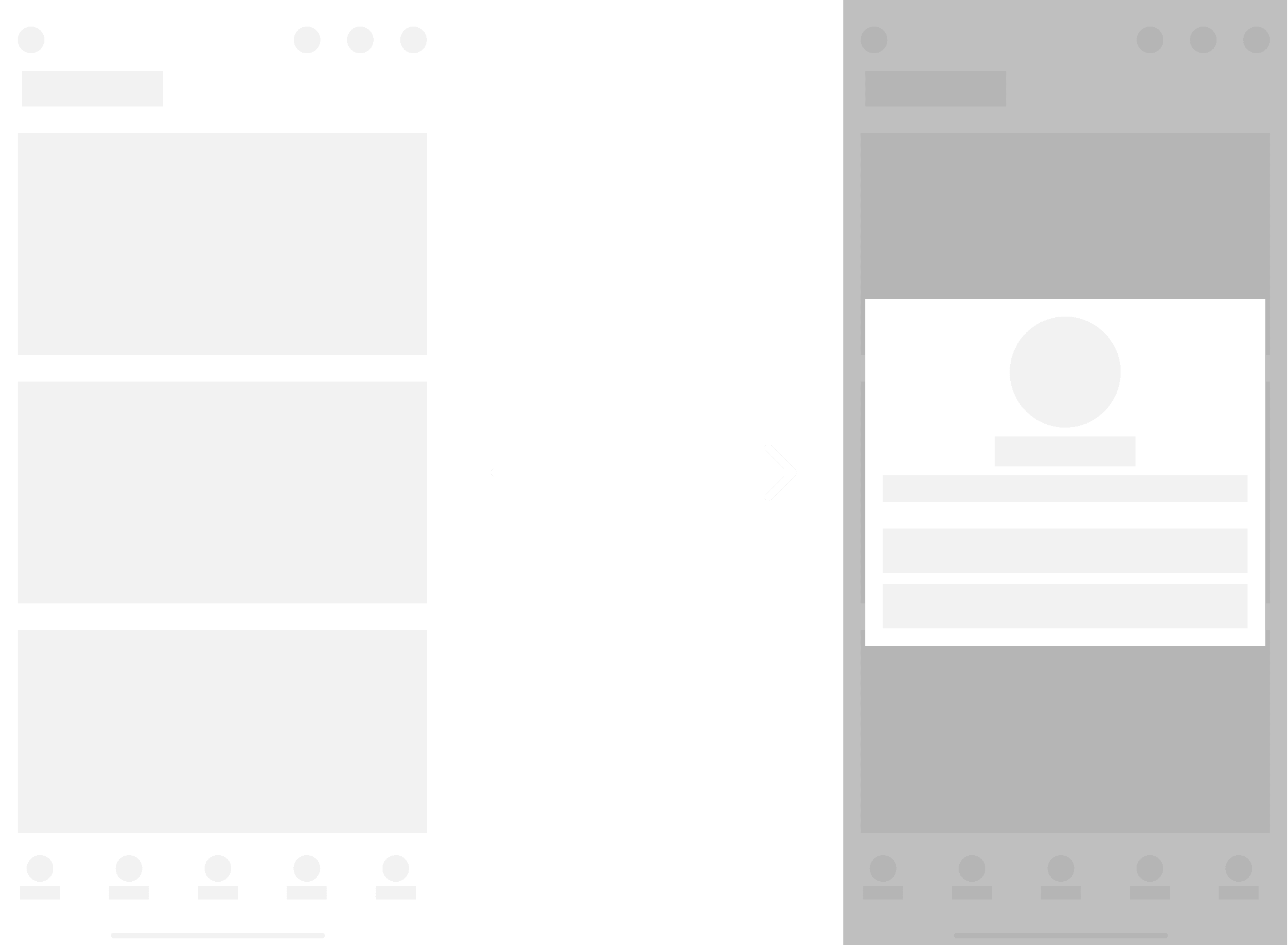
Urgent information
A forced dialog refers to a modal dialog or overlay that appears on the screen and requires immediate attention or action from the user before they can proceed with their current task or interact with the rest of the interface. Unlike optional dialogs that users can dismiss or ignore without consequence, forced dialogs typically present critical information, important warnings, or urgent requests that demand the user's immediate attention.
One of our modality patterns consists of presenting a forced dialog to our user. This is highly dependent on context and should only be shown when the context is urgent. The user will only be allowed to perform actions within the dialog and not allowed to dismiss.
Forms
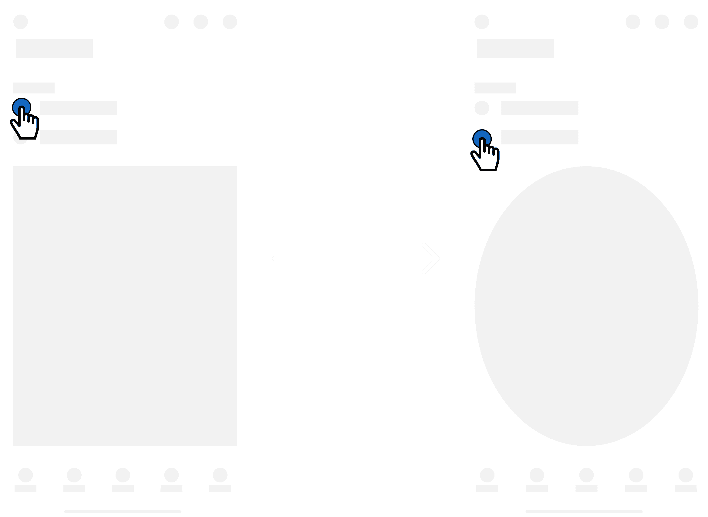
Dynamic input
Dynamic form refers to a form interface that adapts and responds to user input or changes in the form's context. Unlike static forms that remain unchanged regardless of user actions, dynamic forms adjust their structure, content, or layout based on various factors such as user input, device capabilities, or business logic.
One of our form patterns consists of it dynamically adapting based off of user input. Utilizing conditional logic, we will be able to present the user options based off of their previous selection. This aims to enhance usability, reduce friction, and improve the overall form-filling experience for users by intelligently adapting to their needs and input.
Navigation
App bar
A app bar refers to a user interface element typically located at the top of a mobile application's screen. It serves as a central point for displaying key navigation controls, branding elements, and other important information or actions relevant to the current context within the app.
One of our navigation patterns for mobile devices consists of utilizing the top of the interface to display key system level navigation controls. The app bar can also be dynamic.
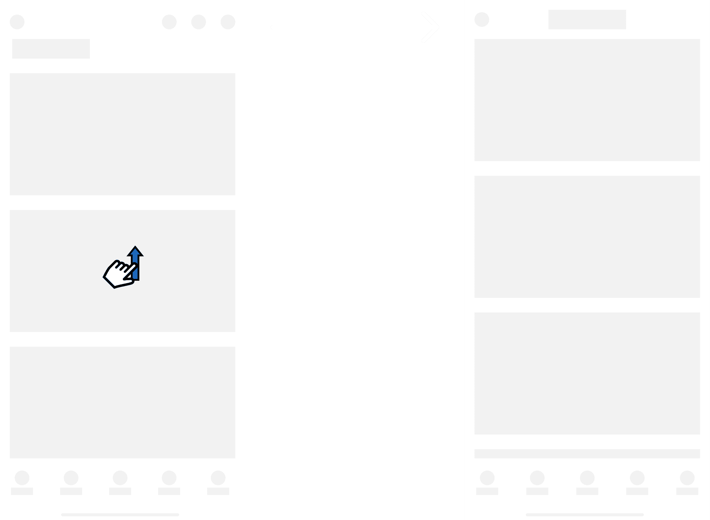
On-scroll
A dynamic app bar refers to a user interface element in mobile applications that adapts its appearance and behavior based on user interactions or contextual changes. It is often found at the top of the screen and typically contains navigation controls, branding elements, and other important information or actions relevant to the current context within the app.
One of our app bar patterns consists of it dynamically changing on-scroll. This aims to preserve screen real estate as the user scrolls through the page. Page title will be anchored to the top trailing a close icon. Main app bar functionality will be hidden on-scroll.
Primary navigation
A primary navigation refers to the core set of navigation elements that facilitate users' movement through the app's main sections or features. It typically includes the primary menu or navigation bar that provides access to essential destinations within the app.
One of our navigation patterns for mobile devices consists of utilizing the bottom navigation pattern for our primary navigation. With 5 nav items being the limit, we are able to shift prioritized focus to main system capabilities at a glance with quick accessibility. This pattern will be able to support future feature’s by nesting them within our secondary navigation. This aims to reduce clutter by categorization and provide abilities to access desired content faster.
Secondary navigation
A secondary navigation refers to additional menu options or navigation elements beyond the primary navigation bar or menu. While the primary navigation typically includes the most important or frequently accessed sections of an app or website, the secondary navigation provides access to less critical or less frequently accessed content.
One of our navigation patterns for mobile devices consists of furthering the information architecture by providing a secondary navigation. Access to the secondary navigation will be from the primary navigation. The last primary nav item will be labeled as “More”. This aims to support future features and categorize information in a digestible way. We can include less prominent screens in the secondary navigation while still maintaining navigation flexibility.
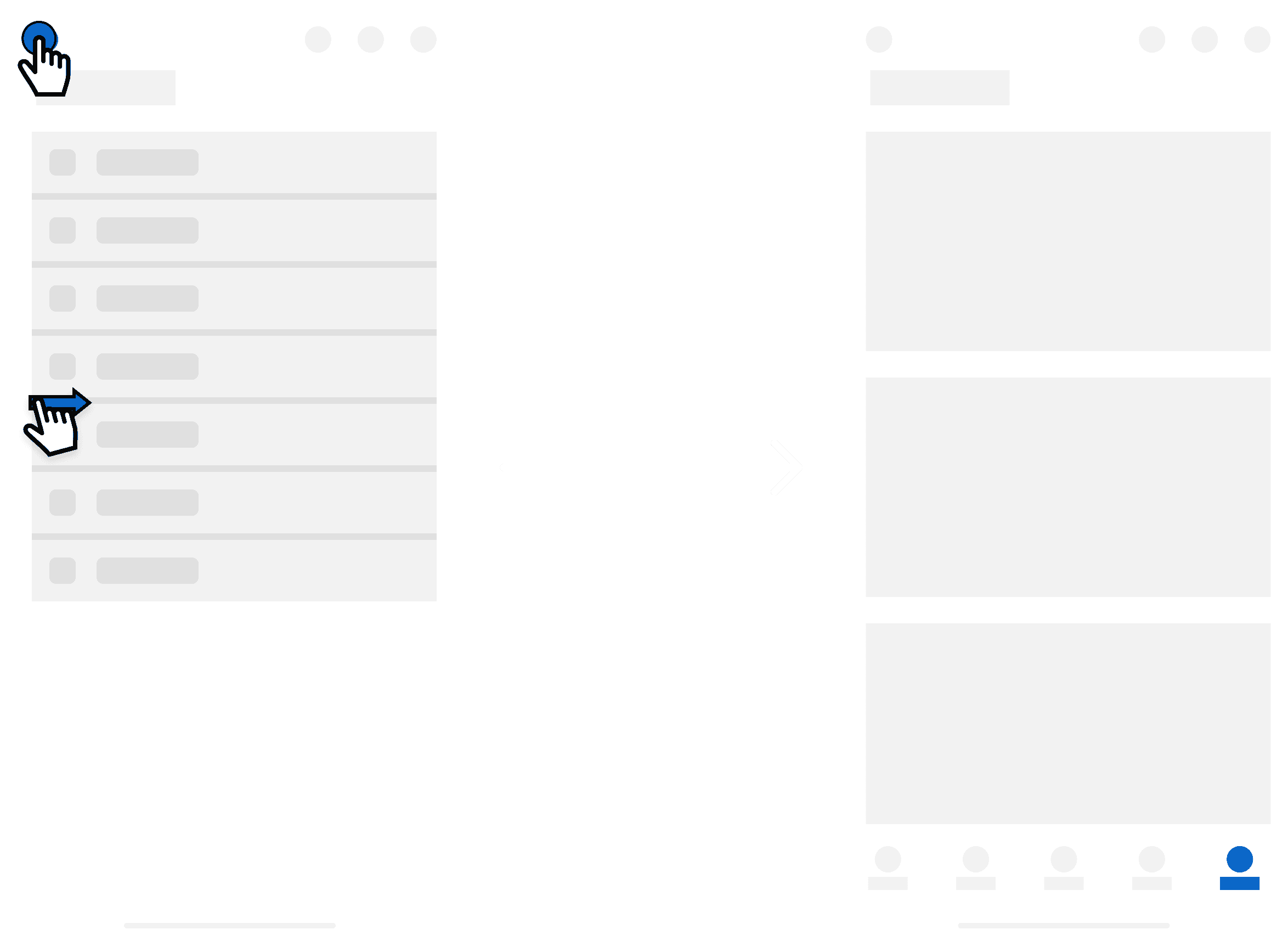
Back navigation
Back navigation refers to the ability for users to return to a previous screen or state within an app's navigation hierarchy. It allows users to backtrack through their interaction history, enabling them to navigate through the app's interface in a logical and intuitive manner.
One of our navigation patterns for mobile devices consists of providing the ability to backtrack for our users. As you breadcrumb throughout the application, you can press the back button in top left corner or perform a swipe right gesture to return to previous screen.
Notifications
Task completion
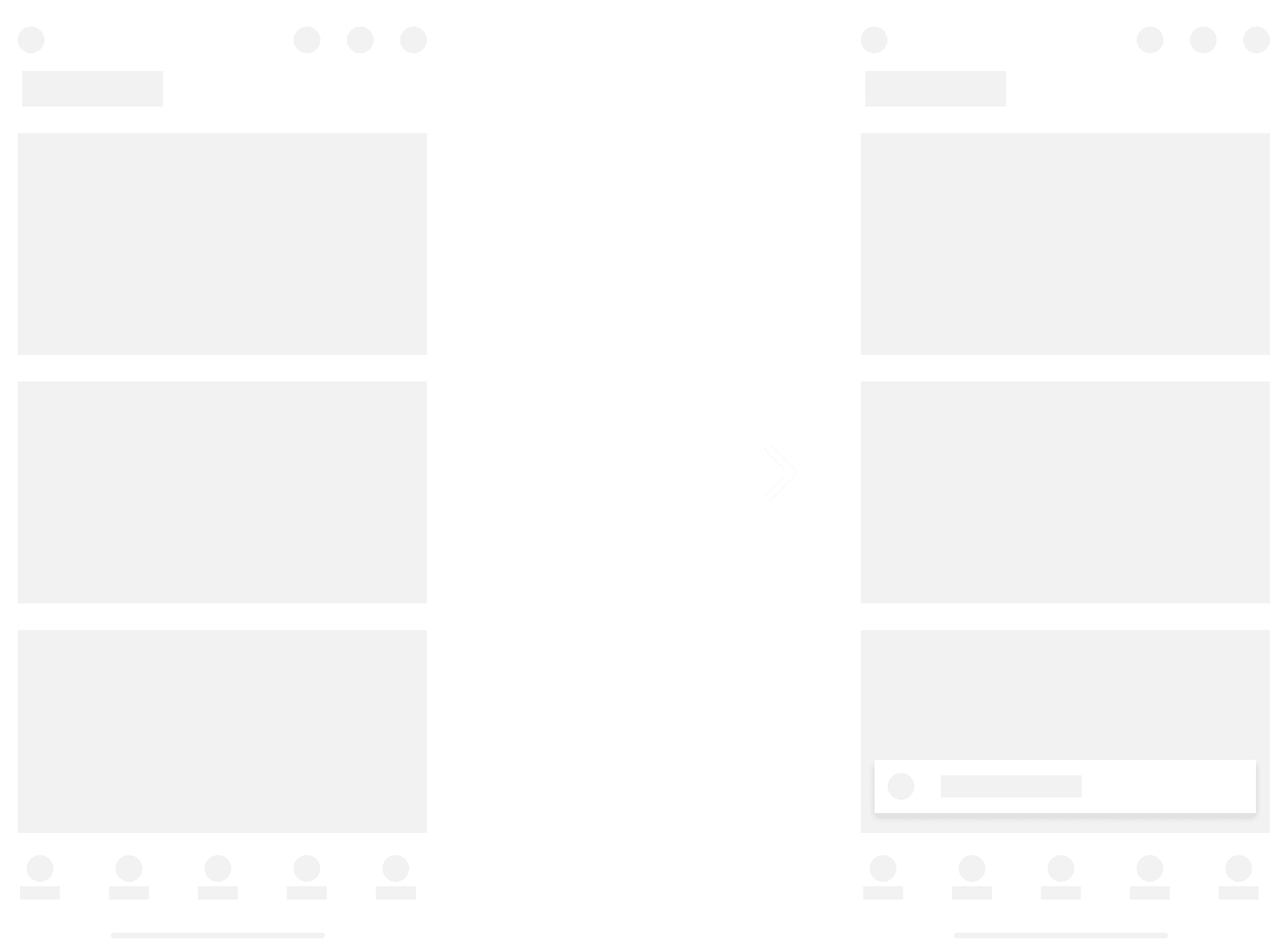
A snackbar refers to a small notification or message that appears briefly at the bottom of the screen to provide feedback, alerts, or contextual information to the user. Named after the concept of a "snack," which is a small, quick bite of information, the snackbar pattern is commonly used to convey non-critical information or actions in a subtle yet noticeable manner.
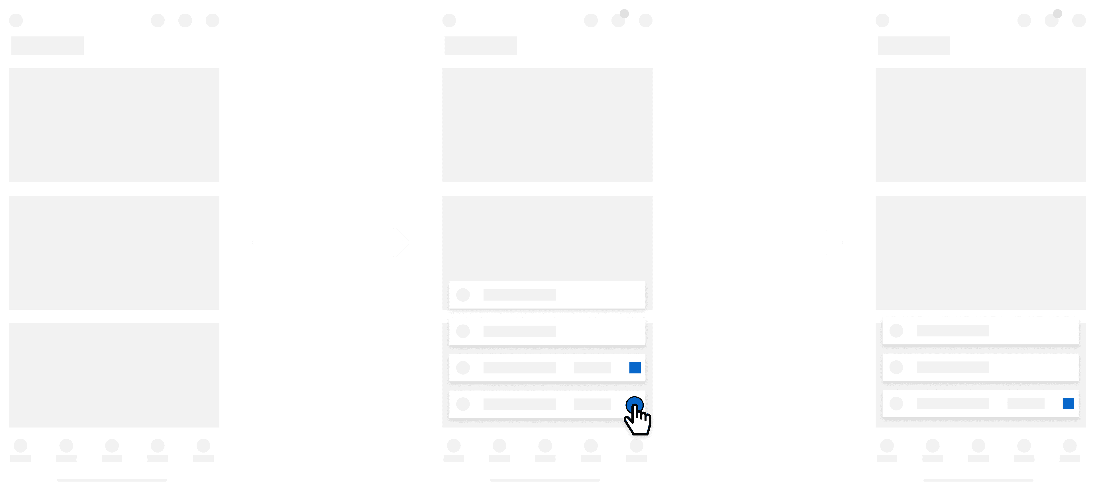
One of our notification patterns consists of a contextual message appearing at the bottom of the screen to inform the user of any feedback. For example, if the user completes an action, provide a alert message to reaffirm the task was completed. These snackbars will be view only with a duration of 2000ms
Action required
One of our notification patterns consists of a contextual message appearing at the bottom of the screen to inform the user of feedback and any actions that need to take place. For example, if user receives a notification that requires action, the snackbar will have an action button as well as a close button. These snackbars dismiss on close. Not only will the user get a message, but an indicator will be present over their notification icon, and message will remain in “notifications”.
Stacking
Snackbar stacking refers to the arrangement of elements on a screen where multiple items are placed on top of each other in a vertical or horizontal layout. In the context of mobile UX design, stacking can be used to organize content, controls, or notifications to optimize space and improve readability. For example, notifications or messages may be stacked vertically in a list, with the most recent notification appearing at the top.
One of our notification patterns consists of stacking snackbars vertically in a list-like format. The max snackbars to be stacked will be 4 at a time, <=50% of vh. We don't want to bombard the user with notifications but still provide them the flexibility of digesting feedback. Snackbars that require manual dismiss, will stay in the stack until user takes action.
Tap target
Touch
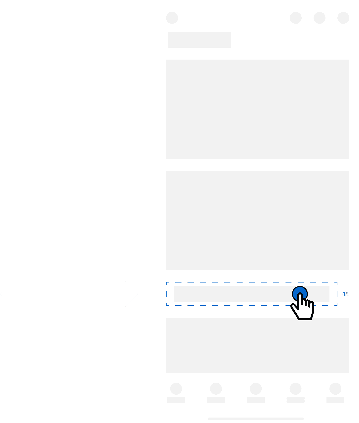
A tap target refers to the area on a touchscreen interface that users can tap or touch to interact with a specific element, such as a button, link, or interactive component. Tap targets are crucial for enabling user interactions within mobile apps and websites, and their design directly impacts the usability and accessibility of the interface.
One of our usability patterns involve ensuring a standardized tap target. Following best practices, the minimum tap target should be 48px to support accessibility for all users.

